Industrial design services
Physical products for the digital age

How we help
Reinvention in action
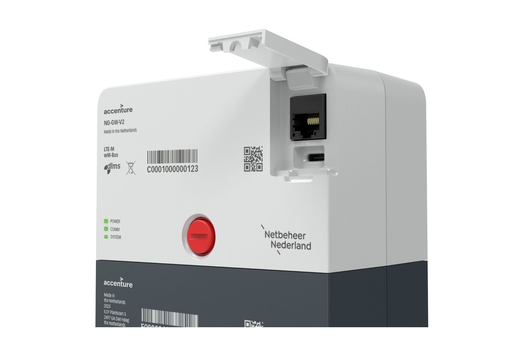
Netbeheer Nederland
We partnered with Netbeheer Nederland, an organization comprising six distribution system operators of the Netherlands' electricity and gas networks, to develop a reference design for a smart electricity meter ready for energy transition.
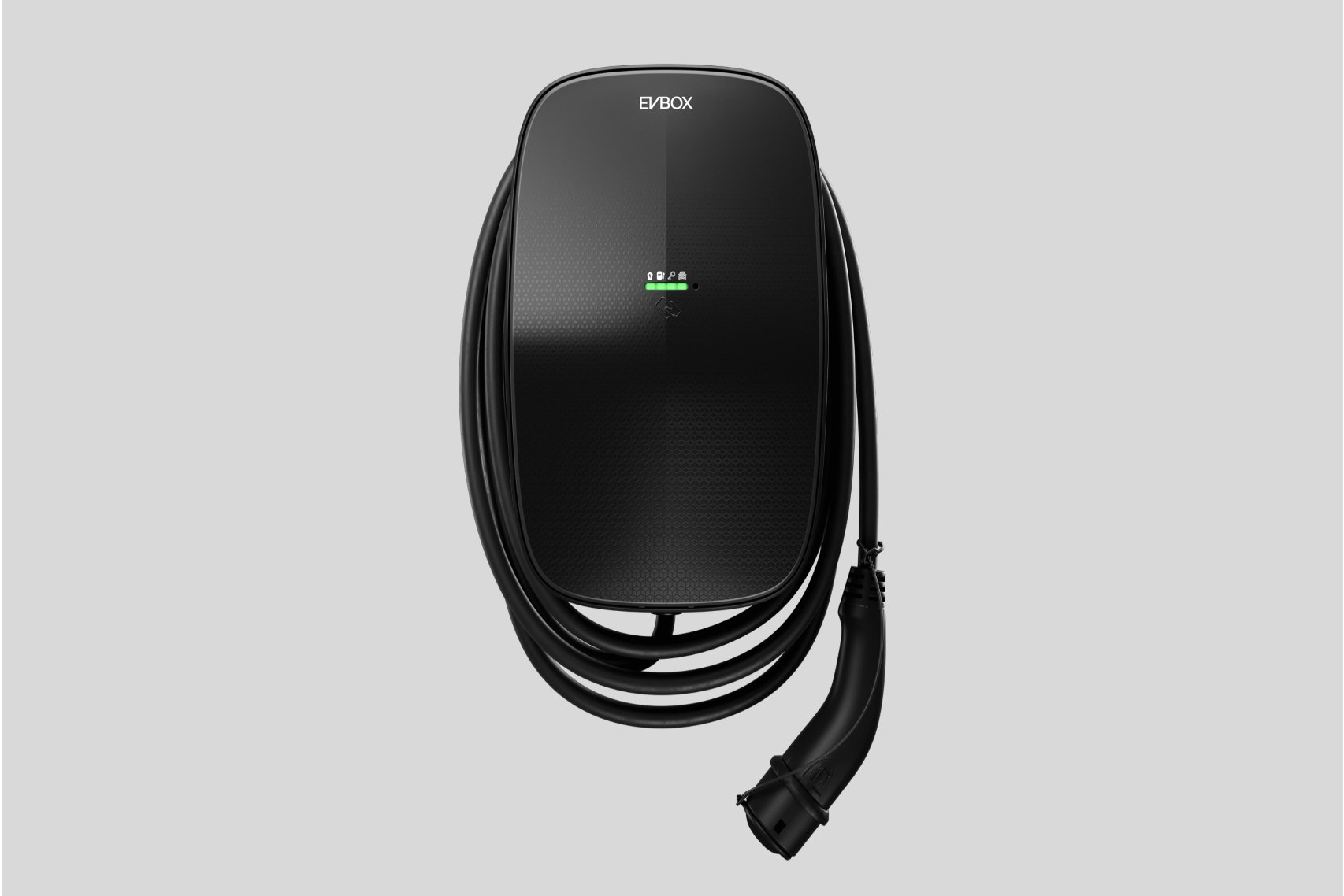
EVBox Livo
In collaboration with EVBox, we reimagined their approach to the domestic EV Charger market.
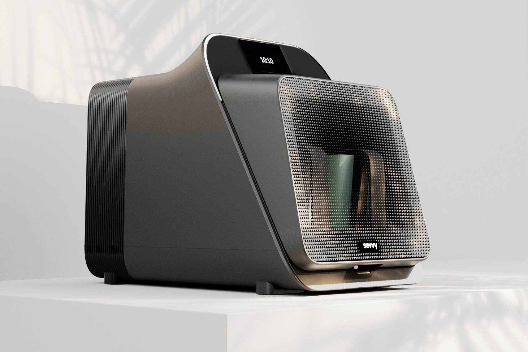
Sevvy Smart Cooker
We teamed up with Sevvy to transform their unique technology into an easy to use consumer product for home cooking.
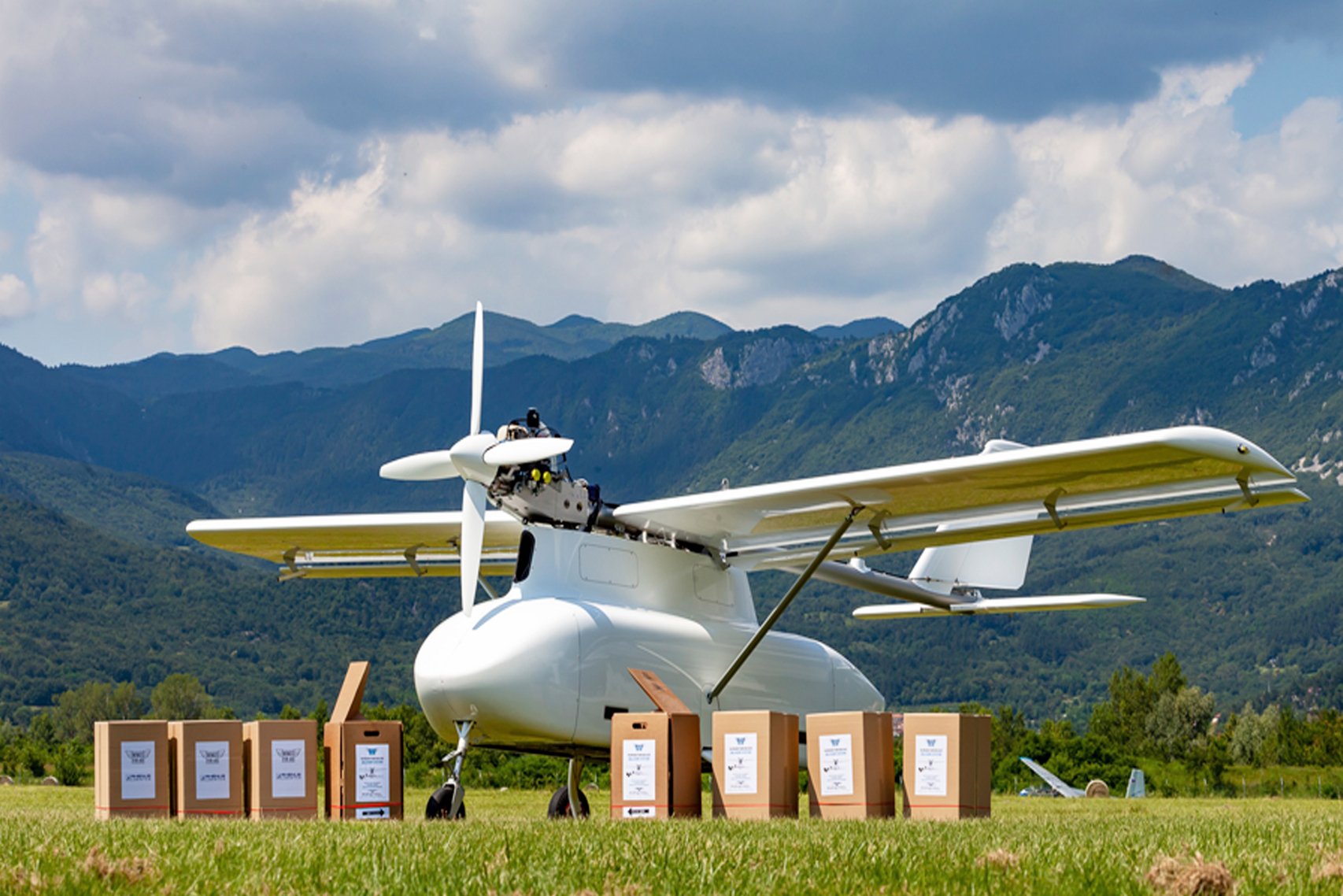
Wings for Aid
We worked with Wings for Aid, a Dutch humanitarian aid group, to develop a Remotely Piloted Aircraft System that delivers humanitarian goods to people isolated by natural disasters and man-made crises.
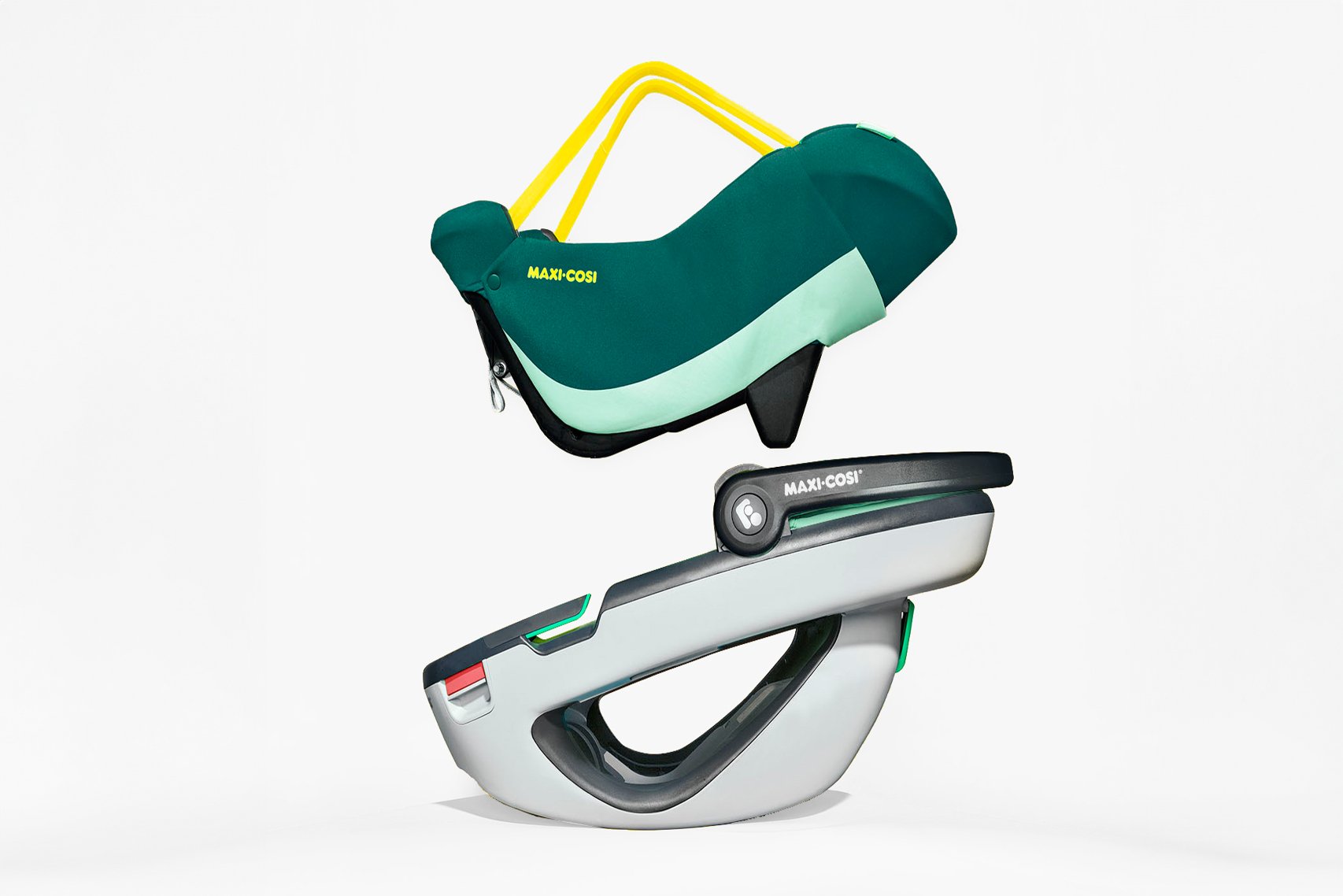
Dorel Juvenile Maxi Cosi Coral
Together with long term client Dorel we set out to revolutionize infant safety seats. Using a demountable inlay to make it easier to carry outside of the car.
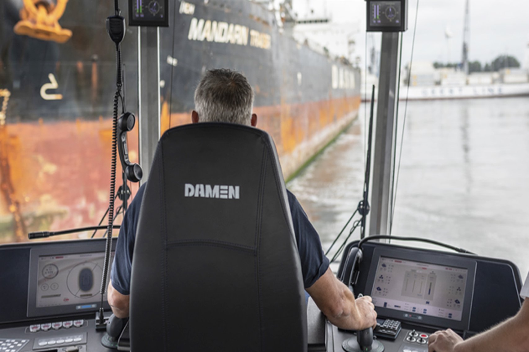
Damen Shipyards Next Gen HMI
A tailor-made tugboat dashboard to help deliver the most up to date information at the right time.
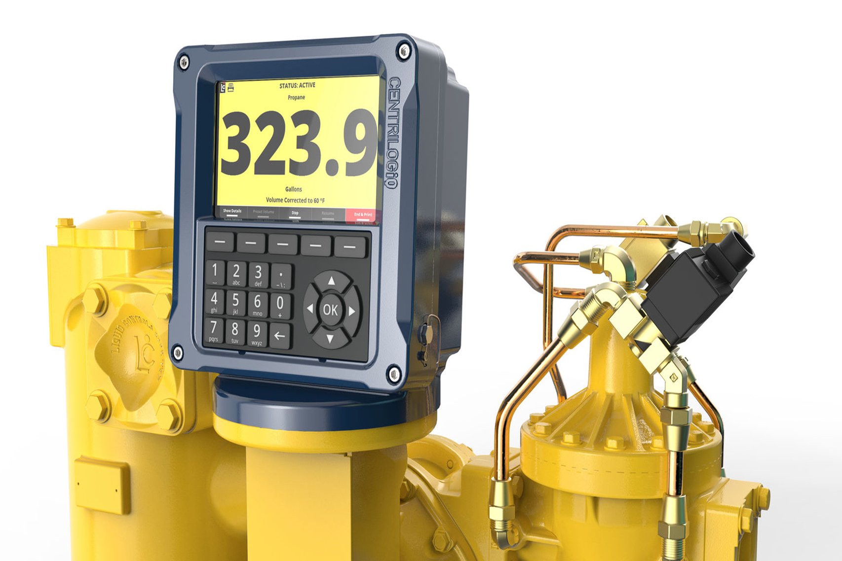
Liquid Controls LCR.IQ
We collaborated with Liquid Controls, a global leader in precision measuring systems, to design a digital smart & connected platform to ensure the future relevance of their business.
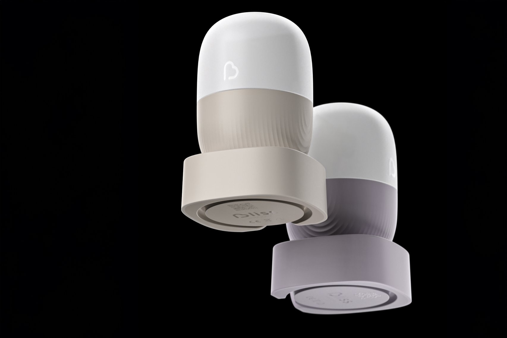
Bliss baby monitor
Our approach to designing sustainable electronic products showcased through the development of a baby monitor.
Our leaders

Frank Rennings
Managing Director Industry X – Netherlands

Teun van Wetten
Design Director – VanBerlo | Part of Accenture
Eric Biermann
Design Development Director

Rodolfo Rangel
Business Design Senior Manager